INTERDISCIPLINARY ART DIRECTION
WORKING ACROSS WEB, IDENTITY, PHOTOGRAPHY AND VIDEO. BASED IN EU.
SERVICES: WEB + MOBILE DESIGN AND BUILD, BRANDING, DIGITAL DESIGN + IDENTITY, ART DIRECTION FOR PHOTOGRAPHY + VIDEO, CREATIVE STRATEGY.
SELECTED CLIENTS: BYCC, COLLECTA, MAX GRÜNINGER, VARSHA RAMESH
VIENNA, AUSTRIA
HELLO@RETROSKI.XYZ
@RETROSKI
INTERDISCIPLINARY ART DIRECTION
WORKING ACROSS WEB, IDENTITY, PHOTOGRAPHY AND VIDEO. BASED IN EU.
SERVICES: WEB + MOBILE DESIGN AND BUILD, BRANDING, DIGITAL DESIGN + IDENTITY, ART DIRECTION FOR PHOTOGRAPHY + VIDEO, CREATIVE STRATEGY.
SELECTED CLIENTS: BYCC, COLLECTA, MAX GRÜNINGER, VARSHA RAMESH
VIENNA, AUSTRIA
HELLO@RETROSKI.XYZ
@RETROSKI
Varsha Ramesh is a photographer and art director working across still life and food. A visual-first thinker, she builds tactile, considered visual worlds, driven by strong aesthetics, storytelling, and attention to detail. Objects are her starting point.
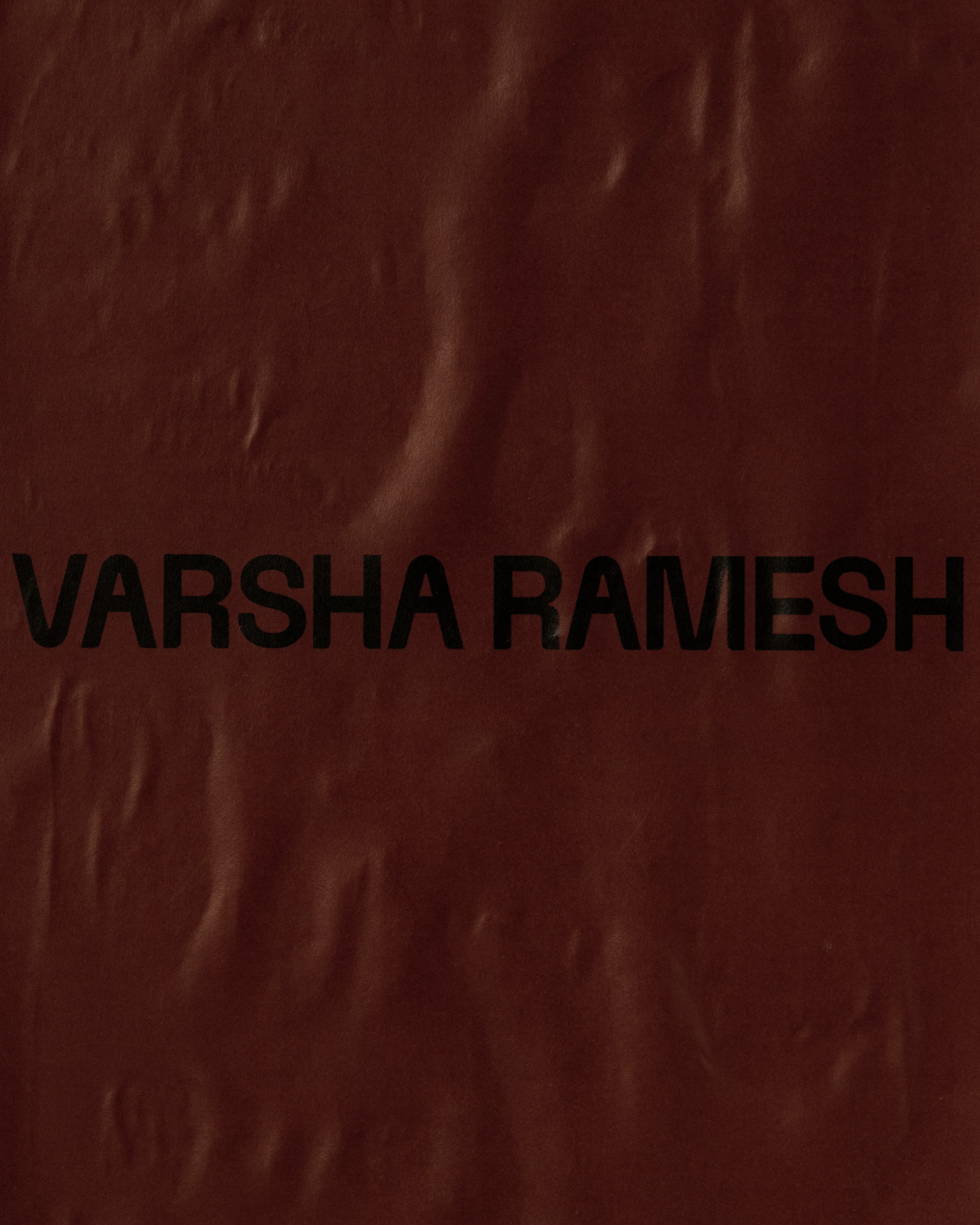
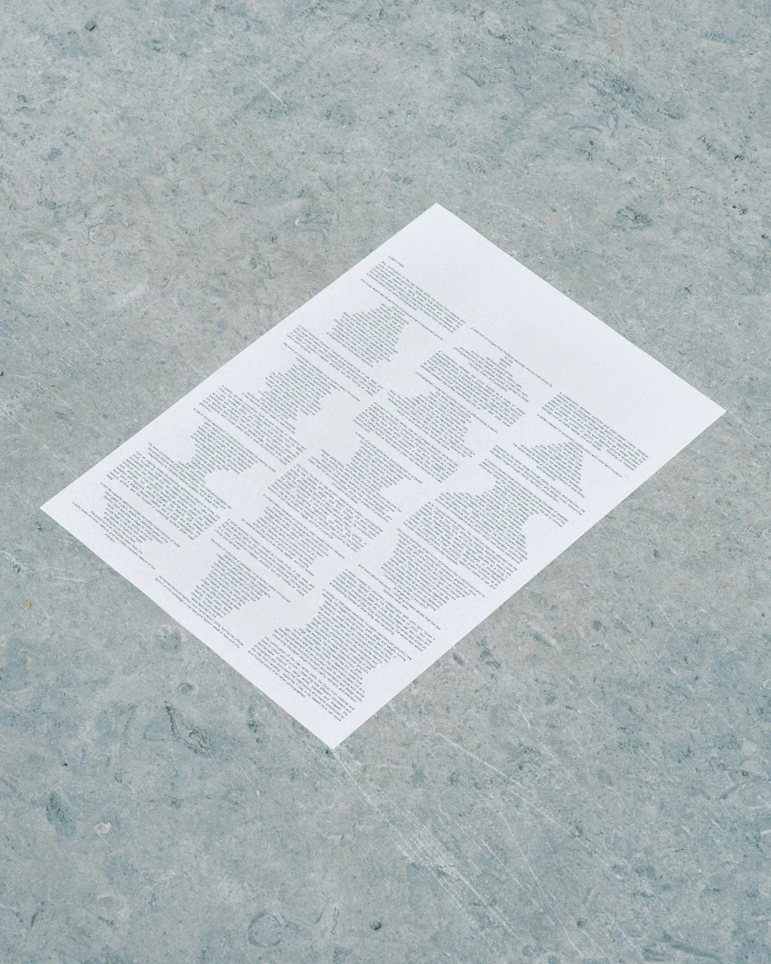
A bold, crimson-brown defines the identity. Deep and striking, the colour was developed together with Ramesh and carries through the stationery: business cards, a tear-away flyer, and a poster. The monogram takes a playful approach, much like her way of working with still life. Stacking, layering, and going beyond the obvious drove the design direction.
Varsha Ramesh is a photographer and art director working across still life and food. A visual-first thinker, she builds tactile, considered visual worlds, driven by strong aesthetics, storytelling, and attention to detail. Objects are her starting point.
A bold, crimson-brown defines the identity. Deep and striking, the colour was developed together with Ramesh and carries through the stationery: business cards, a tear-away flyer, and a poster. The monogram takes a playful approach, much like her way of working with still life. Stacking, layering, and going beyond the obvious drove the design direction.


Interior photography, Villa Tugendhat by Ludwig Mies van der Rohe and Lilly Reich, 1928–30, Brno, Czech Republic
Interior photography, Villa Tugendhat by Ludwig Mies van der Rohe and Lilly Reich, 1928–30, Brno, Czech Republic


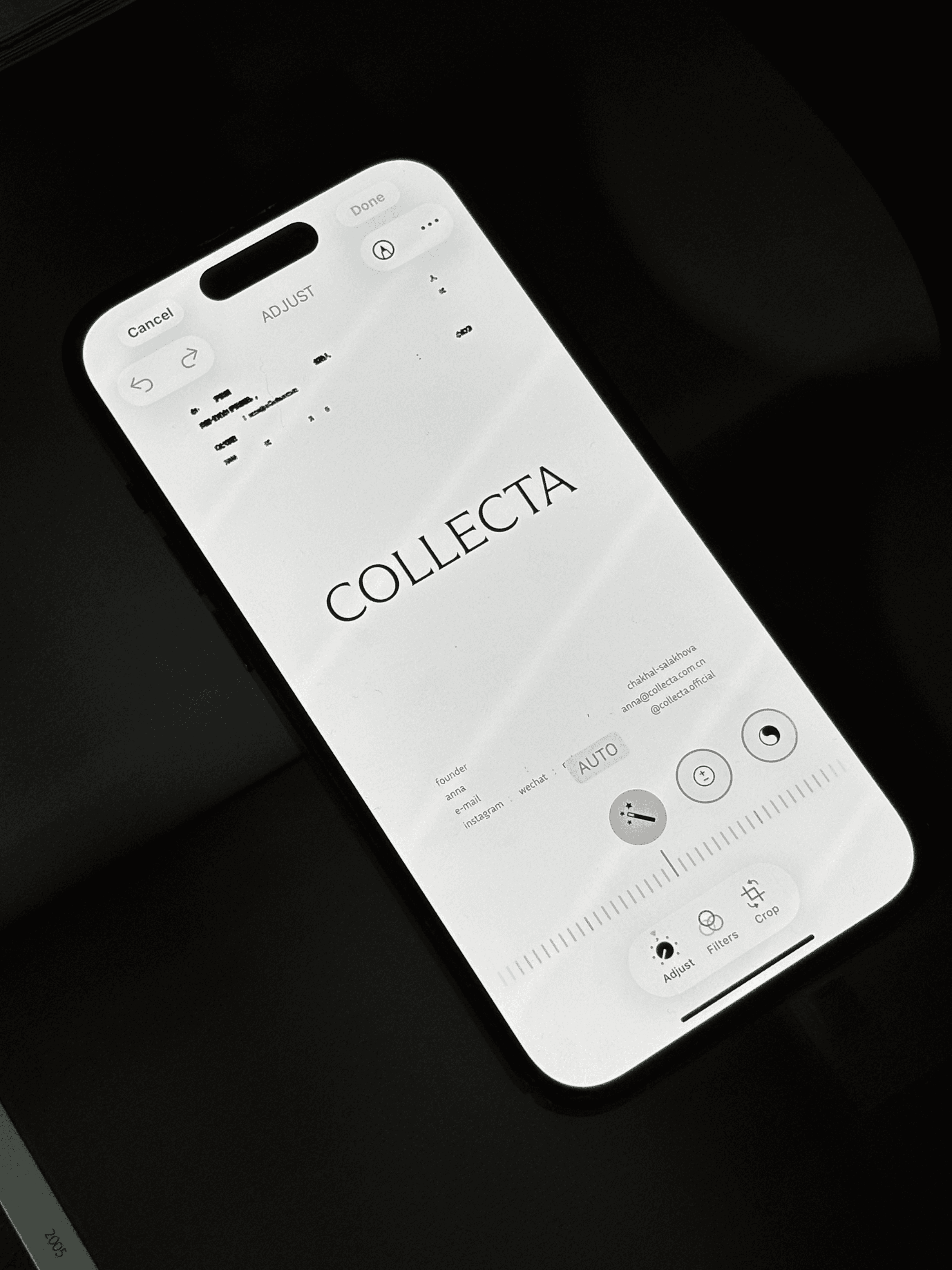
COLLECTA is a production-based residency and research initiative exploring how contemporary art can be developed through collaboration with industrial and technological production systems. Working between Vienna and Shanghai, it supports international artists in developing and realizing their work in China, while fostering exchange across cultural contexts.
The visual identity developed for COLLECTA draws from the concept of the isovist: the total visible area from a single point in space, shaped by walls, openings, and boundaries. This principle is translated into a visual language built on functional signal colours, linking viewpoint, artwork, and exhibition space. The same logic runs through the "C" grapheme, where the form adapts through perspective and evolves based on the viewer's position. COLLECTA operates within this same thinking, extending artistic practice beyond the studio into production, material exploration, and collaboration. The wordmark and typographical exploration reflect this approach throughout, where each element shifts in relation to context rather than staying fixed.
Featuring works and process by Andrea Polichetti, an independent contemporary artist based in Rome, whose practice explores the relationship between time and materiality.
COLLECTA is a production-based residency and research initiative exploring how contemporary art can be developed through collaboration with industrial and technological production systems. Working between Vienna and Shanghai, it supports international artists in developing and realizing their work in China, while fostering exchange across cultural contexts.
The visual identity developed for COLLECTA draws from the concept of the isovist: the total visible area from a single point in space, shaped by walls, openings, and boundaries. This principle is translated into a visual language built on functional signal colours, linking viewpoint, artwork, and exhibition space. The same logic runs through the "C" grapheme, where the form adapts through perspective and evolves based on the viewer's position. COLLECTA operates within this same thinking, extending artistic practice beyond the studio into production, material exploration, and collaboration. The wordmark and typographical exploration reflect this approach throughout, where each element shifts in relation to context rather than staying fixed.
Featuring works and process by Andrea Polichetti, an independent contemporary artist based in Rome, whose practice explores the relationship between time and materiality.


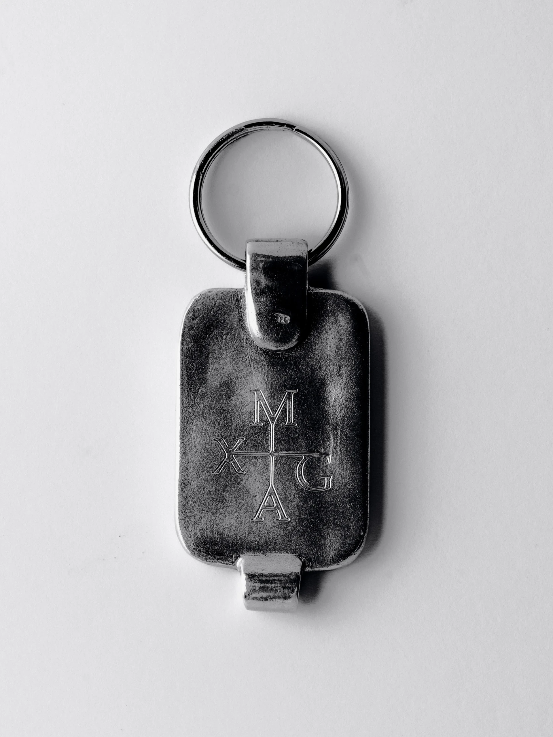
M, A, X and G sit at the four cardinal points, a monogram built on the logic of a weathervane rather than a crest. Cast in silver and carried as a keychain, the signet takes the old idea of the engraved seal and gives it a reason to exist today. The wordmark follows the same thinking into two dimensions. High-contrast serifs are drawn so they can erode. The logo isn't treated as fixed, more as a surface that gets printed, scanned and reprinted, picking up its own wear along the way.
Alongside the identity sits untitled <alt.>, a photograph that refuses to be one. What's left is the sentence a browser writes when an image fails to load, cast in magnesium so it can't disappear. Dimensions, colour profile, byte count: metadata that was never meant to be seen becomes the only image there is.
Object, type and error text, all part of the same identity. Engraved, eroded, and sometimes missing on purpose. Web identity, live now at maxgrueninger.com.
Photography: @maxgrueninger, motion: @turner.motion, web: @glebsavelev, typeface: @newglyph
M, A, X and G sit at the four cardinal points, a monogram built on the logic of a weathervane rather than a crest. Cast in silver and carried as a keychain, the signet takes the old idea of the engraved seal and gives it a reason to exist today. The wordmark follows the same thinking into two dimensions. High-contrast serifs are drawn so they can erode. The logo isn't treated as fixed, more as a surface that gets printed, scanned and reprinted, picking up its own wear along the way.
Alongside the identity sits untitled <alt.>, a photograph that refuses to be one. What's left is the sentence a browser writes when an image fails to load, cast in magnesium so it can't disappear. Dimensions, colour profile, byte count: metadata that was never meant to be seen becomes the only image there is.
Object, type and error text, all part of the same identity. Engraved, eroded, and sometimes missing on purpose. Web identity, live now at maxgrueninger.com.
Photography: @maxgrueninger, motion: @turner.motion, web: @glebsavelev, typeface: @newglyph
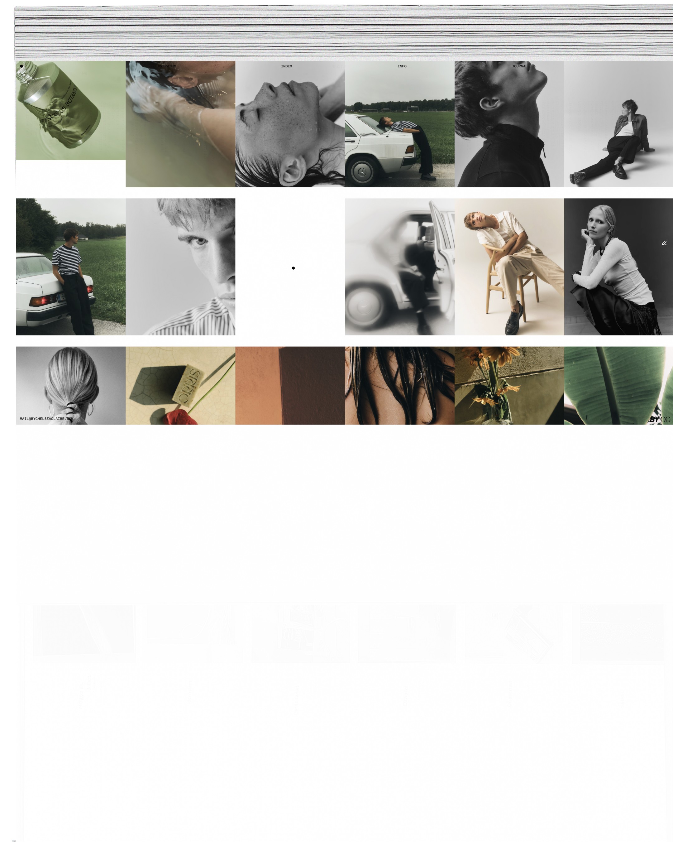
Chelsea Claire is a photographer and multidisciplinary storyteller, originally from the High Country of Victoria, Australia, now based in Austria and working across Europe. With a worldwide client base, she focuses on portraiture, fashion, editorial, and still life.
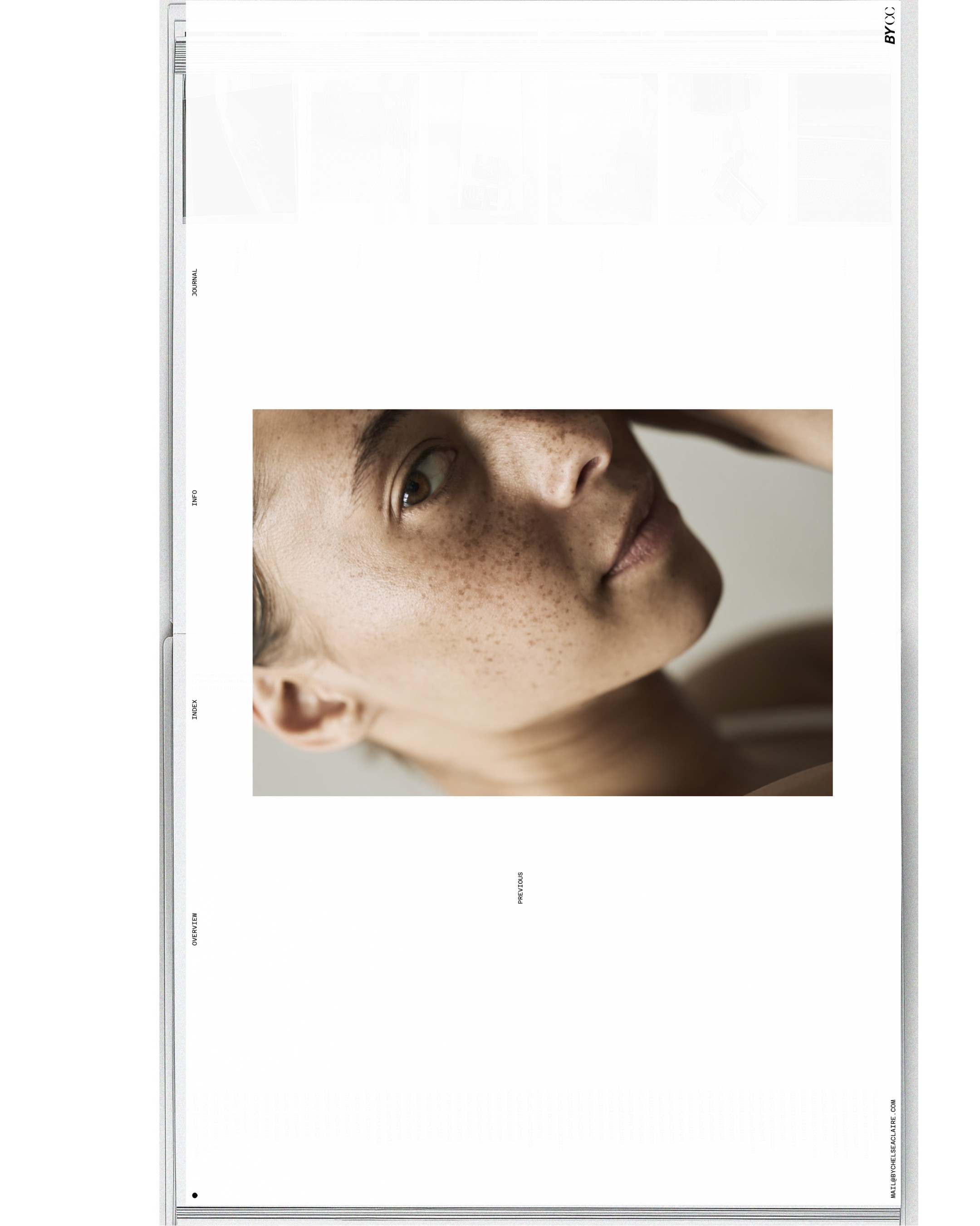
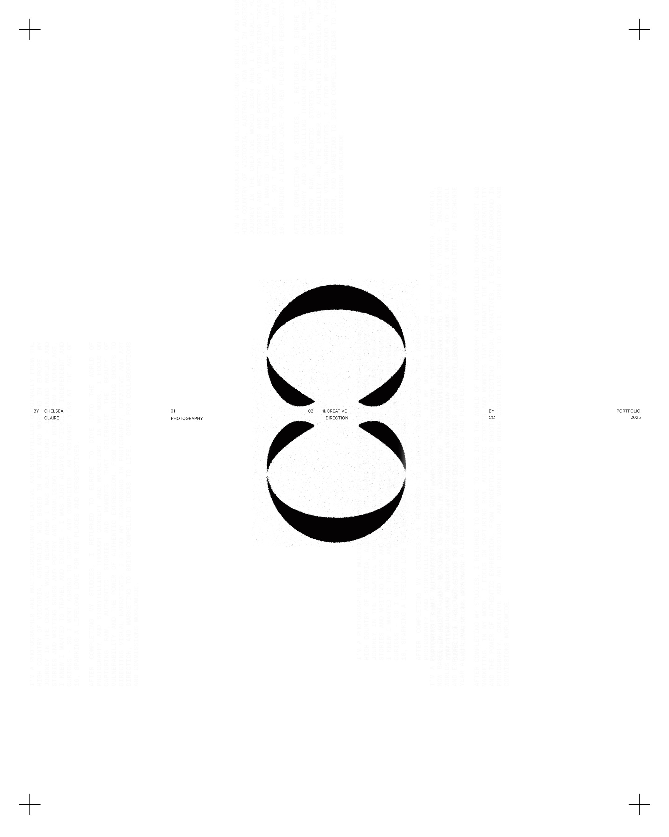
The identity pairs sans and serif typefaces. A contemporary combination, bold yet subdued. Punchy, yet delicate. The logo abbreviates "by Chelsea Claire," accompanied by a dot element that anchors information and visual points across print and digital spaces. A slightly pointed sphere: perfectly round, yet edged.
The editorial look is completed with a simple typeface, often disjointed or reflected, used as a design element to carry essential information about the image, the model, and the storytelling.
Chelsea Claire is a photographer and multidisciplinary storyteller, originally from the High Country of Victoria, Australia, now based in Austria and working across Europe. With a worldwide client base, she focuses on portraiture, fashion, editorial, and still life.
The identity pairs sans and serif typefaces. A contemporary combination, bold yet subdued. Punchy, yet delicate. The logo abbreviates "by Chelsea Claire," accompanied by a dot element that anchors information and visual points across print and digital spaces. A slightly pointed sphere: perfectly round, yet edged.
The editorial look is completed with a simple typeface, often disjointed or reflected, used as a design element to carry essential information about the image, the model, and the storytelling.
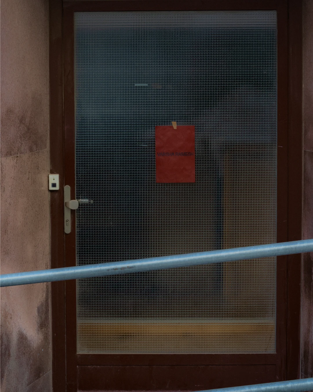
Varsha Ramesh is a photographer and art director working across still life and food. Drawn to still life for the freedom it offers, she recontextualises the everyday to highlight form, texture, and materiality.
The website showcases her latest work through a simple, story-led approach. The landing page pairs images with an interview, where Ramesh discusses the individual pieces, the motivation, and the art direction behind them. The crimson-brown of the identity opens the site and sets its tone.
Varsha Ramesh is a photographer and art director working across still life and food. Drawn to still life for the freedom it offers, she recontextualises the everyday to highlight form, texture, and materiality.
The website showcases her latest work through a simple, story-led approach. The landing page pairs images with an interview, where Ramesh discusses the individual pieces, the motivation, and the art direction behind them. The crimson-brown of the identity opens the site and sets its tone.
The web identity starts from untitled <alt.>, a photograph that refuses to be one. What's left is the sentence a browser writes when an image fails to load, cast in magnesium so it can't disappear. Dimensions, colour profile, byte count: metadata that was never meant to be seen becomes the only image there is.
Object, type and error text, all part of the same identity. Engraved, eroded, and sometimes missing on purpose. Live now at maxgrueninger.com.
Credits: Photography: @maxgrueninger, motion: @turner.motion, web: @glebsavelev
The web identity starts from untitled <alt.>, a photograph that refuses to be one. What's left is the sentence a browser writes when an image fails to load, cast in magnesium so it can't disappear. Dimensions, colour profile, byte count: metadata that was never meant to be seen becomes the only image there is.
Object, type and error text, all part of the same identity. Engraved, eroded, and sometimes missing on purpose. Live now at maxgrueninger.com.
Credits: Photography: @maxgrueninger, motion: @turner.motion, web: @glebsavelev