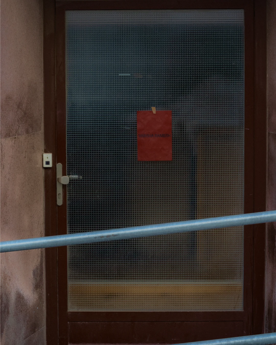
Varsha Ramesh is a photographer and art director working across still life and food. A visual-first thinker, she builds tactile, considered visual worlds, driven by strong aesthetics, storytelling, and attention to detail. Objects are her starting point. Drawn to still life for the freedom it offers, she recontextualises the everyday to highlight form, texture, and materiality.
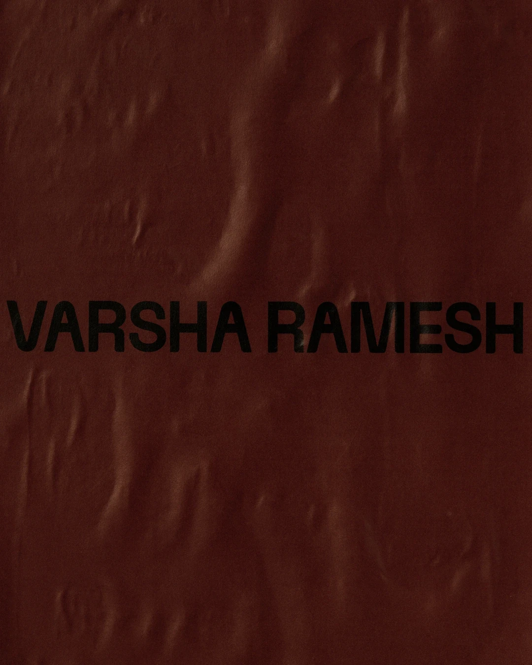
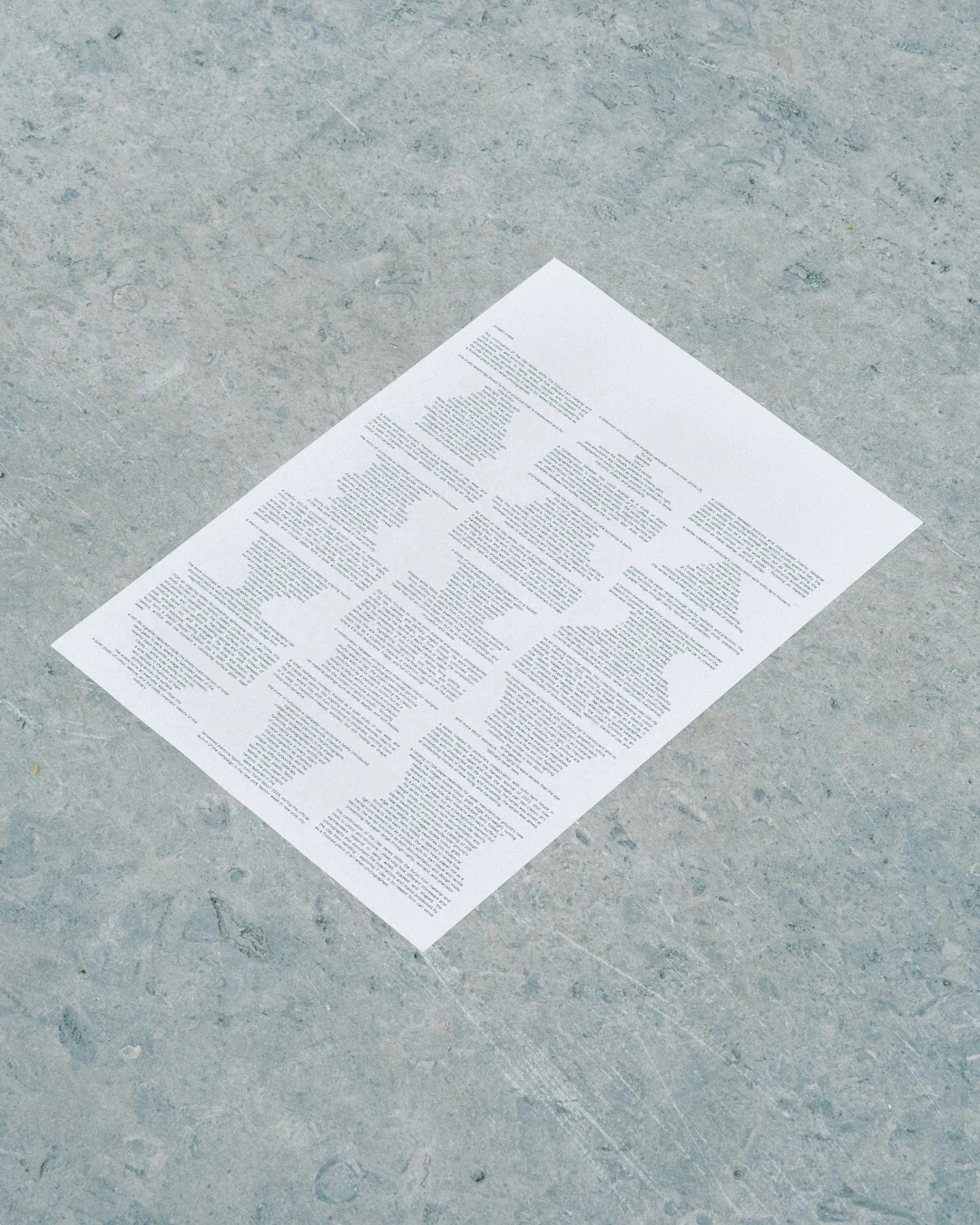
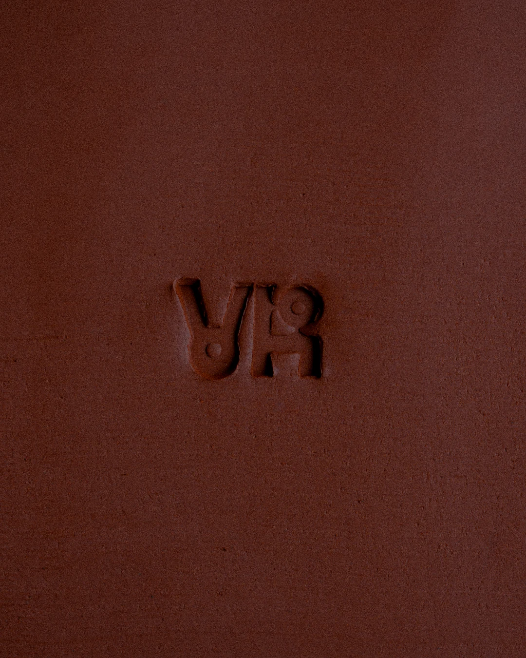
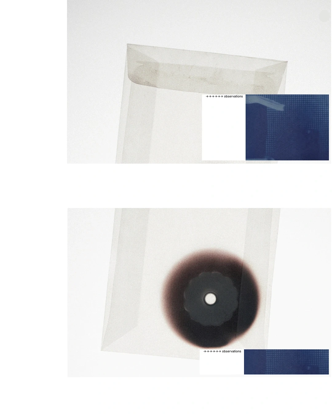
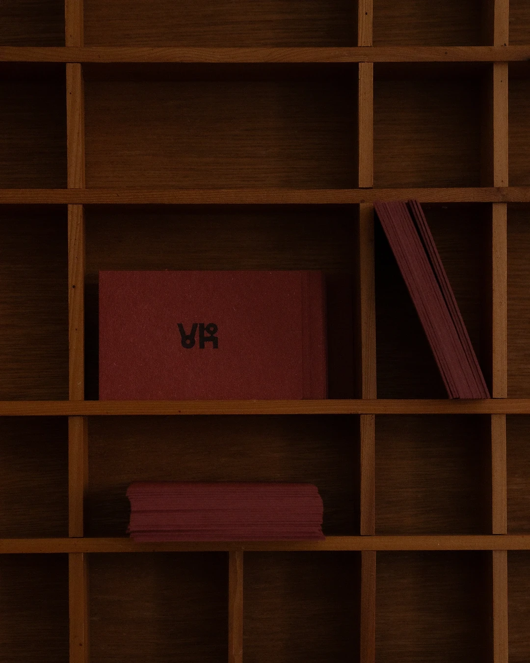
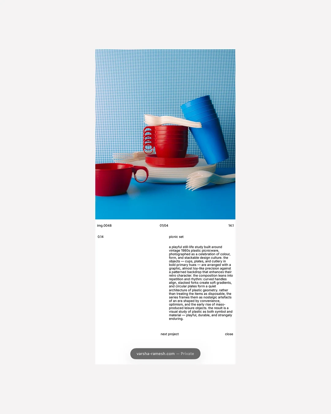
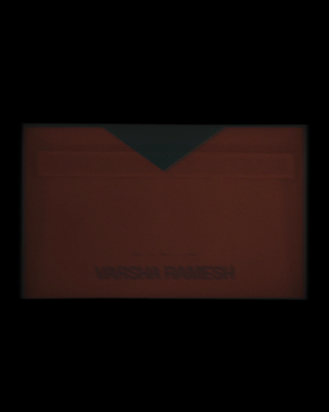
The scope of work covered website design, built to showcase her latest work through a simple, story-led approach. The landing page pairs images with an interview, where Ramesh discusses the individual pieces, the motivation, and the art direction behind them. A bold, crimson-brown defined the branding. It opens the website and carries through the stationery: business cards, a tear-away flyer, and a poster. Deep and striking, the colour was developed together with Ramesh. The monogram took a playful approach, much like her way of working with still life. Stacking, layering, and going beyond the obvious drove the design direction.
Credits
RETROSKI for Varsha Ramesh